Digital Branding

How to Brief a Designer for a Logo That Lasts

A clear brief gets you better concepts in fewer rounds. Here’s what to include, and how to judge logo options objectively.
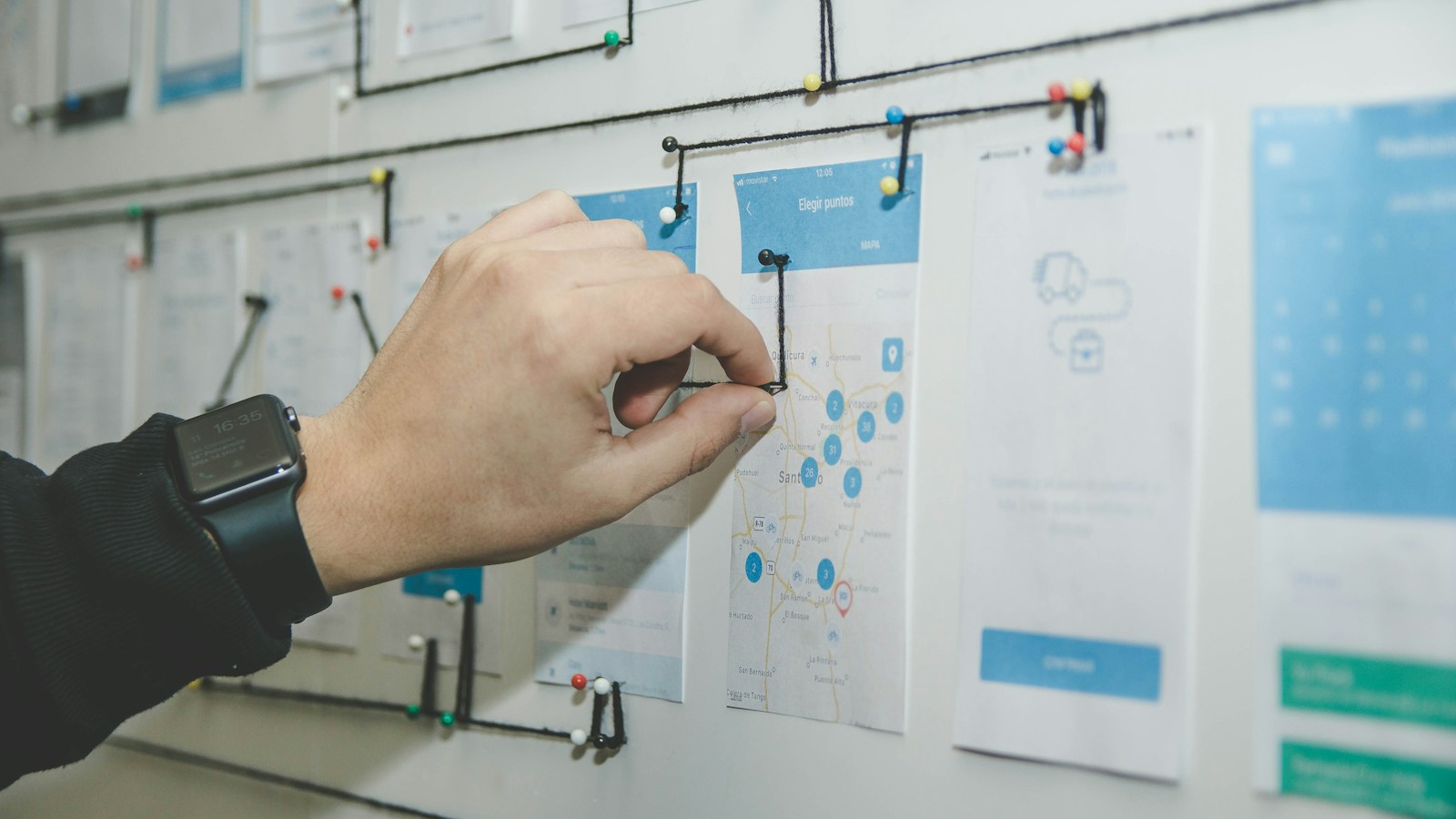
Graphic designer collaborative workshop desk with a highlighted creative brief document, moodboard inspiration clippings, hand-sketched geometric logo concepts, and pens.

Key takeaways

  • Describe your business, audience and personality, not just the look you want.
  • Share references with reasons: what you like and why.
  • Judge logos on clarity, scalability and fit with strategy, not personal taste alone.
  • Make sure you receive full ownership and all file formats at the end.

What to put in the brief

  1. About the business: what you do, how long you’ve been doing it, and where you operate.
  2. Audience: who buys from you and what they value.
  3. Positioning: what makes you different, and who your main competitors are.
  4. Personality: three to five adjectives describing how the brand should feel.
  5. Name and tagline: exact spelling, and whether the tagline is part of the logo.
  6. Where it will be used: website, app icon, signage, packaging, embroidery, vehicles.
  7. References: logos you like and dislike, with a sentence on why.
  8. Must-haves and must-avoids: colours, symbols or styles that are required or off-limits.
  9. Timeline and decision-makers: who approves and by when.

Why references need reasons

“I like this logo” tells a designer little. “I like how simple this logo is and that it works in one colour” gives clear direction. Reasons also help separate what you like personally from what fits your brand.

How to evaluate concepts

  • Simplicity: can it be recognised at a glance and remembered?
  • Scalability: does it work as a tiny app icon and on a large sign?
  • Versatility: does it work in one colour and on dark and light backgrounds?
  • Relevance: does it suit your industry and audience without being a cliché?
  • Distinctiveness: would it be confused with a competitor?
  • Longevity: will it still look appropriate years from now, or does it rely on a passing trend?

Giving useful feedback

  • Consolidate feedback from everyone into one response.
  • Describe problems rather than prescribing solutions: “it feels too playful for our clients” is more useful than “make it blue”.
  • Test concepts in context, such as a mock-up on your website header, business card and signage.
  • Sleep on it. First reactions are often about novelty rather than suitability.

What you should receive

  • Vector source files, plus SVG, PNG with transparent background, and PDF.
  • Colour versions for screen (RGB) and print (CMYK, and spot colours if used).
  • Logo variations: primary, horizontal, icon, single colour, reversed.
  • A short usage guide covering clear space, minimum size and colours.
  • Written confirmation that you own the rights to the final design.

Check that the design is original, and consider registering it as a trademark in the classes relevant to your business. This protects your investment as the brand grows.

Our Digital Branding process includes a structured brief, multiple concepts, revisions and full file handover.

Frequently asked questions

How many logo concepts should I expect?

It varies by package, typically between two and eight initial directions. Fewer, well-reasoned concepts are often more useful than many quick ones.

Should my logo show what my business does?

Not necessarily. Many strong logos are abstract or typographic. A literal symbol can help in some industries but can also limit you if your offering grows.
Want us to do this for you?

Talk to the Vintorex team about digital branding. Free consultation, reply within 2 working hours.